← Back to Main
Multiple Globes
4/15/2025, 5:54:37 AM | Jeanyoon Choi
Original Notes (Pre-LLM)
Ecological/Environmental Data Visualisation?
Global Social Index Data Visualisation?
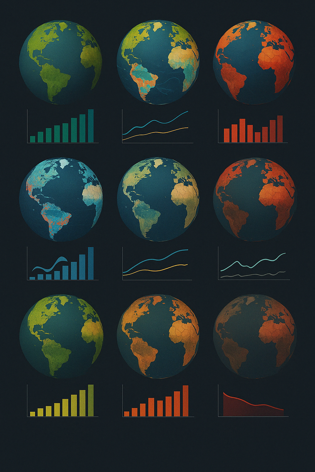
All involve the globe, earth, worldwide map… So that we can spot some indexes on top of this (GRACE, SWOT, The Flight Simulator…)
But normally single channel - we only plot a single globe. Single data. Limited representation. Limited plotting
If we have multiple globes, then we have multiple dimensions. We have a dimension of alternative scenario/speculative scenario. Multiple globes? If we’re plotting 2D globe visualisation, then we have 3D -- If we’re plotting 3D globe visualisation, then we have a fourth dimension to plot!
Speculative example: Each user has its own globe. They plot/activate stuff they want to implement -- and each globe comes out with its own speculative future/simulation. They play with the interaction -- click on the button, implement some speculative scenario, maybe some voice input, accelerometer interaction (even -- phone rotation) -- and their decision makes ecological simulated changes to the globe, some flourishing, some becoming a dead body… So this is a scenario of ‘alternative globes’ -- also what we can incorporate are some graphs to supplement these globe visuals. A status. So a unit consists of: 3D globe in the middle, and multiple graphs surrounding (ideally lower-right? Is it good to have these graphs? Maybe show graphs upon user interaction: globe ←> graphs transition?) So these are each independent unit. But wholistically, there are lots of globes, plotted in grid within the screen, and these globes each have their own situation/simulation. Creating a whole part of the ‘globe system’... Our objective: Not to make it very complicated, but simple, intuitive interaction. This might also cause some competition vibes! Good thing about multiplicity - small multiples. (Might there be some speculative examples on small multiples of the globes?) I want to make it intuitive, easy, and playful for kids!
Another example: Not exactly ‘simulated’ globes, but what if GRACE-like visualisations across the globe are presented across multiple screens - again grid-layout, with each different scenario? This time more complex, entangled experience for adult audiences --- The audience interacts ‘system’, and probabilistically different scenario (i.e. when ipcc makes reports - best, moderate, worst case scenario - smth like that) appears within different globes (say 12 globe - 3X4 grid layout - upper row best, middle moderate, lower row worst case) -- and this globe is full of data visualisation. This data is interactive and also somehow time series, so the interaction itself should be fun and intuitive - user scrolls down/slider adjustment/button adjustment → immediate change occurs within data visualisation which alters the shape of the globe. And this unit globe aggregates… again to form a sort of a system.
Globe -- do they only have to be plotted in grid? Maybe grid layout might be boring. Speculative layout - globe inside globe inside globe inside globe inside globe? 귤껍질과 같은… Or to be more game like: Globe 당구대 상에 있는 구와 같이, 서로 데굴데굴 굴러다니고, 충돌하고? But has clear pros and cons!
Multi-faced | Multiplied Data Visualisation
Good globes, good data visualisation: Ever-evolving, continuously changing, not static. The data is alive, the data actively transforms/evolves → LIke a living creature.
English Version (LLM-Generated)
Title: Multi-Dimensional Global Data Visualization: Exploring Alternative and Interactive Scenarios
Introduction
Recent advancements in ecological, environmental, and global social index data visualization have largely relied on a singular representation—a single globe displaying a specific dataset. While effective to a point, this conventional methodology presents limitations in dimensionality and representation. This paper outlines an innovative approach whereby multiple globes are used to explore alternative or speculative scenarios, thus adding additional dimensions that enrich user interaction and data interpretation.
Expanding the Visual Framework
Traditional visualizations typically involve a single channel: one globe representing one set of data. However, the introduction of multiple globes allows for a deeper exploration of complex, multi-dimensional information. For instance, when a two-dimensional globe is employed, a third dimension is implicitly introduced through speculative scenario analysis. Similarly, a three-dimensional globe can incorporate a fourth dimension of data visualization—be it temporal evolution, alternative future states, or user-driven interactions.
A Speculative Example: Interactive, Personalized Globes
Imagine an application in which each user controls an independent, interactive globe. Users can activate various data overlays—such as ecological indexes, social indicators, or hypothetical scenarios—to simulate speculative futures. For example, interactions such as tapping a button, providing voice input, or even utilizing accelerometer data (e.g., phone rotation) could trigger modifications in the simulation. As a result, parts of the globe might demonstrate flourishing ecosystems, while others may indicate ecological collapse.
Each unit in this system consists of a central 3D globe accompanied by supplementary graphs that indicate status and trends. These additional visual elements can be designed to appear dynamically through user interaction, transitioning fluidly between the globe visuals and graphical data. When aggregated together in a grid layout, each unit globe forms part of a larger, cohesive “globe system” that is interactive, intuitive, and even playful—an ideal design to engage younger audiences.
Alternative Approaches: Complex, Entangled Visualizations
In a more advanced context targeted at adult users, multiple interactive screens could display GRACE-like visualizations across several globes arranged in a grid format. For instance, a 3x4 grid could represent various scenarios—top row depicting best-case outcomes, the middle row moderate, and the bottom row worst-case scenarios, reminiscent of IPCC reports. In this framework, time-series data narratives could be incorporated, allowing users to manipulate sliders or buttons to observe immediate changes in data-driven globe shapes and behaviors. Each unit not only represents a scenario on its own but also contributes to a broader, interconnected system.
Beyond Grid Layouts: Exploring Creative Possibilities
While grid layouts provide a structured approach, they may become monotonous for some applications. Alternatives such as nested globes (one globe within another) or dynamic, game-like simulations (e.g., globes that behave like billiard balls, rolling and colliding with one another) could elevate the visual experience. These methods offer their own sets of advantages and challenges, but each holds the potential to refresh and reinvigorate global data visualizations.
Conclusion
The concept of multi-faced, multiplied data visualization invites us to consider data as a dynamic entity—ever-evolving and interactive, almost like a living creature. By moving beyond static, singular representations and embracing a system of interconnected, interactive globes, we can create visualizations that are not only more informative but also more engaging. This approach offers the prospect of a more intuitive human-computer interaction and opens up new avenues for both scholarly inquiry and practical application in the fields of environmental science, social analysis, and beyond.
Korean Version (LLM-Generated)
다음은 환경·생태 및 글로벌 사회 지표 데이터 시각화에 관한 내용을 전문적으로 재작성한 것입니다.
──────────────────────────────
1. 서론
현재 환경(또는 생태) 및 글로벌 사회 지표 데이터 시각화는 전 세계, 지구, 또는 세계 지도를 활용하여 여러 지표(예: GRACE, SWOT, 플라이트 시뮬레이터 등)를 한 눈에 보여주고자 합니다. 그러나 전통적인 방식은 단일 채널에 의존하여 단 하나의 지구본이나 단일 데이터만을 시각화함으로써 표현 및 플로팅의 차원이 제한되는 문제가 있습니다.
──────────────────────────────
2. 다중 지구본을 활용한 다차원 데이터 시각화
여러 개의 지구본을 활용하면, 시나리오별(대안 혹은 가설적 시나리오)로 추가적인 차원을 도입할 수 있습니다. 예를 들어, 2차원 지구본 시각화에서는 3차원의 정보를, 3차원 지구본 시각화에서는 4차원 이상의 정보를 구현할 수 있게 됩니다.
──────────────────────────────
3. 가설적 사례: 사용자 맞춤 지구본 시뮬레이션
각 사용자가 개별적인 지구본을 소유하여, 원하는 데이터를 활성화하고 이를 통해 특정 가설적 미래나 시뮬레이션 결과를 도출할 수 있는 시스템을 구상할 수 있습니다. 사용자 상호 작용은 다음과 같은 다양한 입력 방식을 통해 이루어집니다.
• 버튼 클릭
• 음성 입력
• 가속도계(예: 스마트폰 회전 감지)
사용자의 선택에 따라 생태계 변화가 시뮬레이션되며, 어떤 지구본은 번영하는 모습을, 다른 지구본은 황폐화된 모습을 보여줄 수 있습니다. 이처럼 '대안적 지구본' 시나리오에 그래프 등의 보조 자료를 추가하여 시각화 단위를 구성할 수 있습니다. 예를 들어, 중앙에 3D 지구본을 배치하고, 그 주변(예를 들어 우측 하단)에 해당 상태를 나타내는 다양한 그래프들을 배치하거나, 사용자의 상호작용에 따라 지구본과 그래프 간 전환 효과를 적용할 수 있습니다.
이와 같이 각각 독립적인 단위를 구성한 후, 화면 내 그리드 형태로 여러 지구본을 배열하여 전체 '지구본 시스템'을 구현할 수 있습니다. 목표는 복잡성을 배제하고, 직관적이며 단순한 상호작용을 제공하는 것입니다. 또한, 작은 배수 데이터(small multiples)의 장점을 활용하여 경쟁적인 분위기도 조성할 수 있습니다.
──────────────────────────────
4. 또 다른 예: 다중 스크린을 활용한 GRACE 유사 시각화
이 사례에서는 반드시 ‘시뮬레이션된’ 지구본이 아니라, GRACE와 유사한 기술로 생성된 전 세계 데이터를 여러 화면에서, 그리드 형식(예: 3×4 배열 등)으로 제시할 수 있습니다.
- 상단 행: 최상의 시나리오
- 중간 행: 보통의 시나리오
- 하단 행: 최악의 시나리오
각 지구본은 방대한 데이터 시각화를 포함하며, 시계열 데이터와 상호작용성을 갖추고 있습니다. 사용자가 스크롤, 슬라이더 조정, 혹은 버튼 클릭 등으로 조작할 때 즉각적으로 변화가 감지되어 지구본 형태가 변경됩니다. 이러한 단위 지구본들은 다시 전체 시스템으로 집약되어 하나의 복합적 데이터 시각화를 완성합니다.
──────────────────────────────
5. 지구본 배치 및 레이아웃 고려 사항
지구본은 반드시 그리드 형태로만 배치되어야 하는 것은 아니며, 다양한 레이아웃(예: 서로의 내부에 중첩되는 형태 혹은 마치 당구대 위의 공처럼 구슬들이 굴러다니며 충돌하는 형태 등)을 통해 사용자가 새로운 방식의 상호작용을 경험할 수 있도록 할 수 있습니다. 다만 각각의 배치 방식은 고유의 장단점을 갖고 있으므로, 최종 설계 시 신중한 검토가 필요합니다.
──────────────────────────────
6. 결론
다면적이며 다중 배수(멀티페이스드, 멀티플라이드) 데이터 시각화는 정적인 정보 제공을 넘어 지속적으로 변화하고 진화하는 데이터를 생생하게 표현할 수 있는 가능성을 제시합니다. 데이터가 마치 살아있는 생물체처럼 스스로 변형·발전하는 모습을 통해, 사용자에게 직관적이며 재미있는 인터랙션 경험을 제공하는 것을 궁극적인 목표로 설정할 수 있습니다.
──────────────────────────────
요약하면, 본 접근 방식은 환경 및 글로벌 사회 지표 데이터를 보다 다차원적이고 상호작용적인 방식으로 시각화하여, 사용자에게 단순하지만 직관적이고 재미있는 경험을 제공하는 것을 목표로 합니다.
Tags
System Art Layouts
Modular Composition
Grid Systems Design
Digital Art Layers
Multi-Device Artworks
Spatial Composition
2D Layout Strategies
3D Layout Exploration
Collage Aesthetics
Chaotic Order
Algorithmic Layout
Generative Composition
Deconstructivist Layouts
Hyperbolic Geometry Art
Emergent Aesthetics
Whole Greater Than Sum
Interactive Layouts
Speculative Interfaces
System Modularity
Visual Organization
Text written by Jeanyoon Choi
Ⓒ Jeanyoon Choi, 2024